Strategic Workshops & Brand Discovery
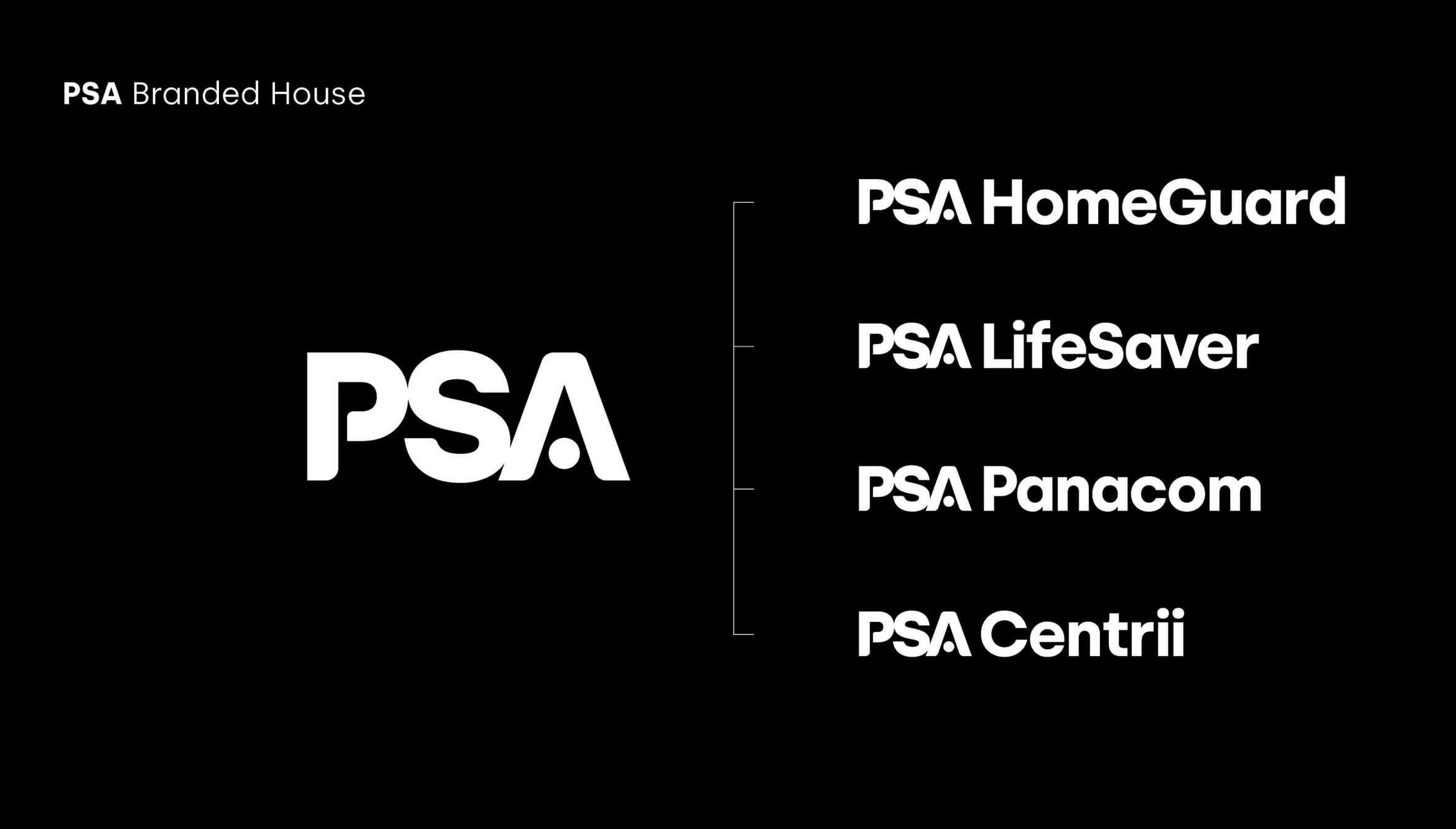
We began by conducting a series of in-depth strategic workshops with key PSA stakeholders. These sessions revealed a clear appetite for change and a desire to modernise the brand without losing sight of PSA’s foundational values of trust and expertise. Through this process, we identified the need to move from a fragmented "house of brands" to a unified "branded house" model, with the PSA master brand at the forefront.
Bold New Brand Architecture
One of the most impactful changes was the shift in brand architecture. PSA transitioned from operating under multiple sub-brands to a cohesive branded house structure. This new approach allowed PSA to streamline its messaging and showcase the strength of the master brand, creating a more unified and recognisable presence.
Introduction of the PSA Safe Tagline
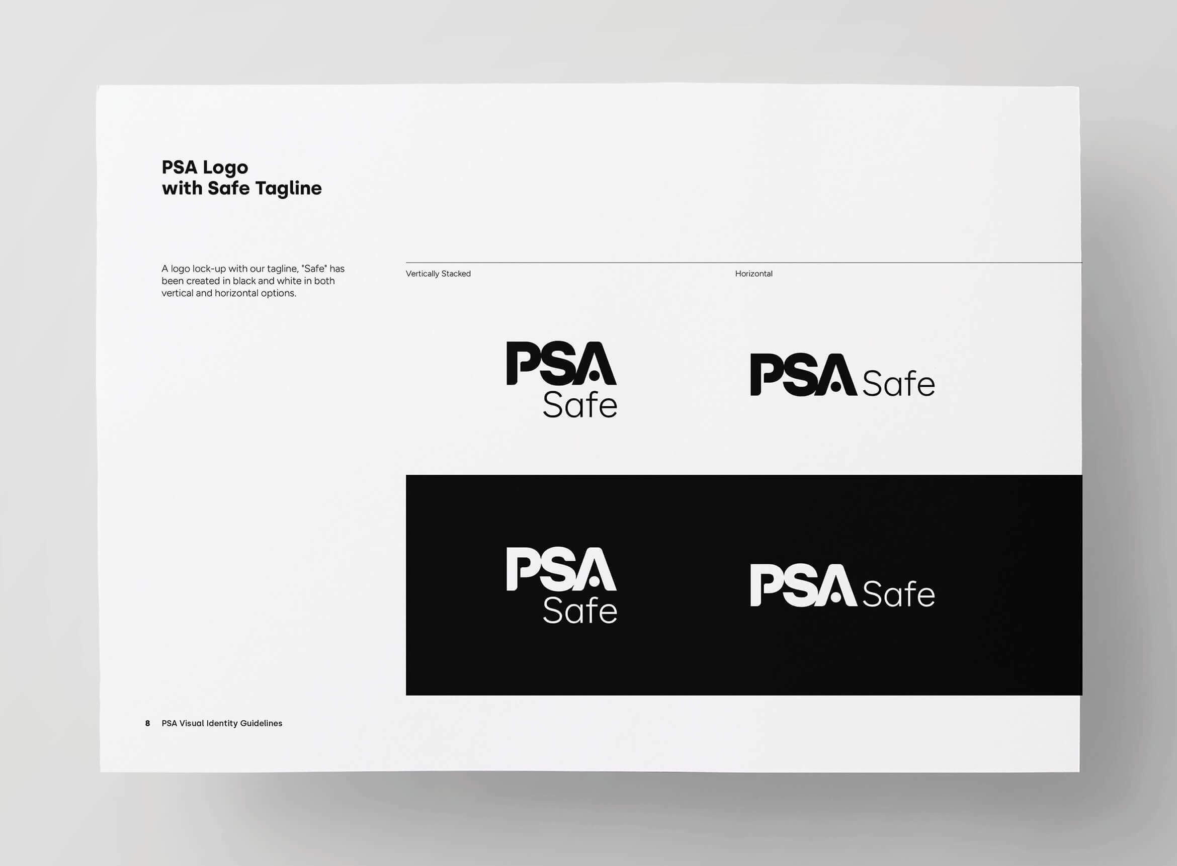
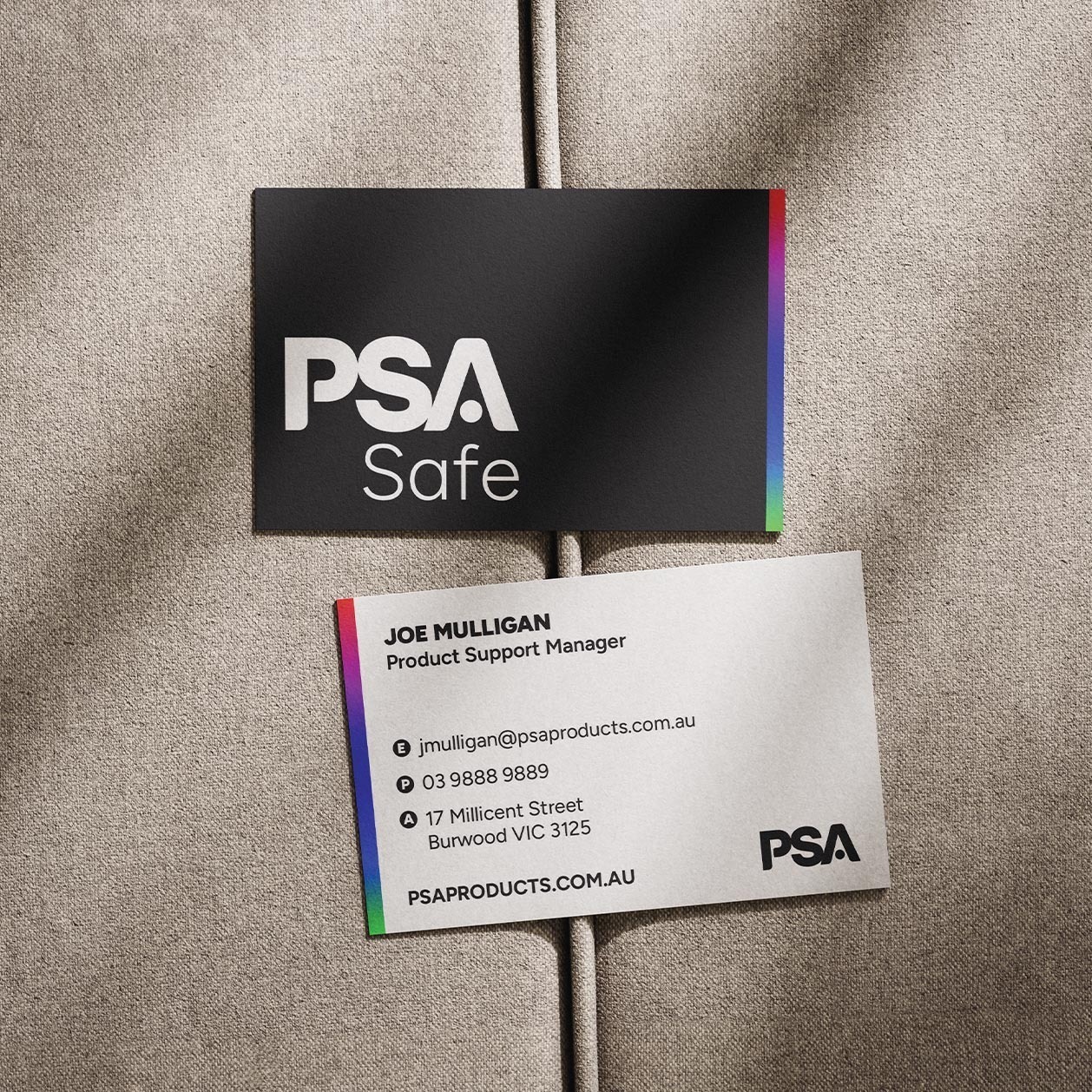
To further reinforce PSA’s reputation as a leader in safety, we introduced the tagline “PSA Safe.” This simple yet powerful statement encapsulates the trust and assurance PSA offers, aligning perfectly with their core mission to protect people and property. The tagline speaks directly to the company’s purpose and serves as a badge of confidence in the marketplace.
Bold Visual Identity
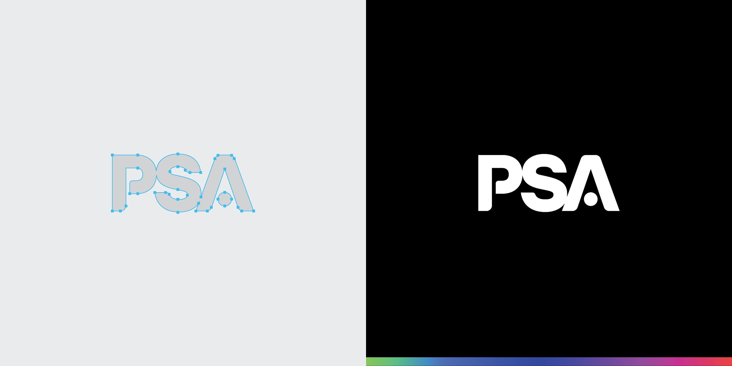
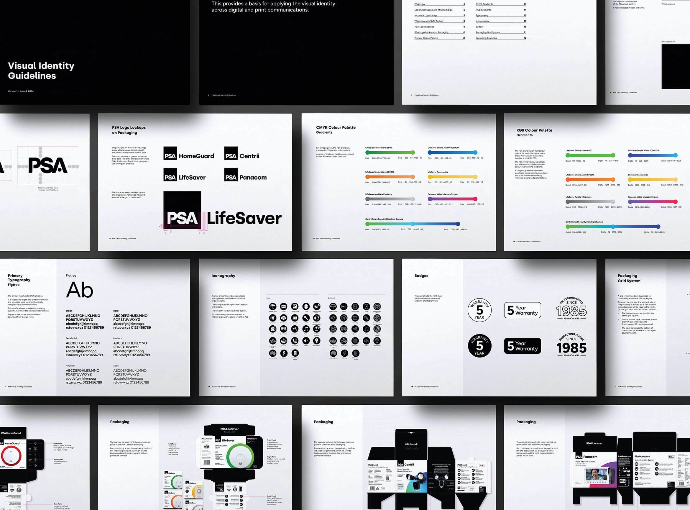
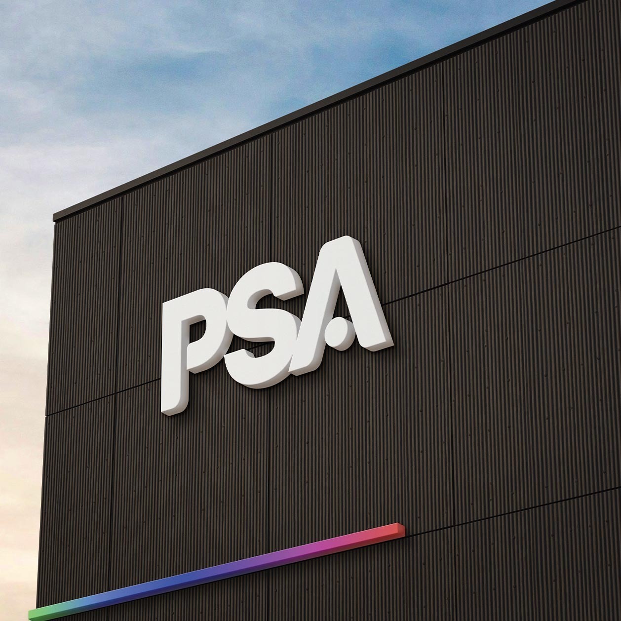
We set out to create a bold, modern, and iconic visual identity for PSA—one that would resonate with their target audience and stand the test of time. The new primary colour palette was anchored in black and white, ensuring the brand conveyed strength and authority. To complement this, we introduced a vibrant, full-spectrum secondary palette, adding both energy and flexibility for use across product lines and marketing materials. A custom typeface was crafted for the new PSA logo, blending balance with distinctive character and legibility at any scale. This ensured brand clarity and high impact across all touchpoints.
Packaging, Merchandise & Apparel
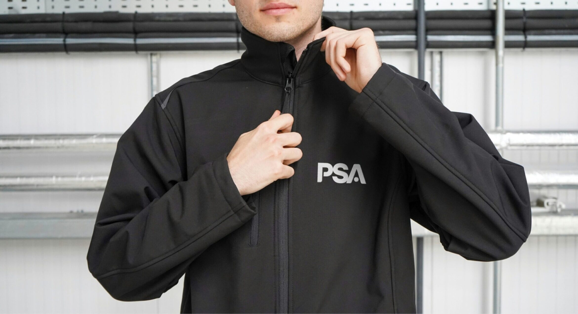
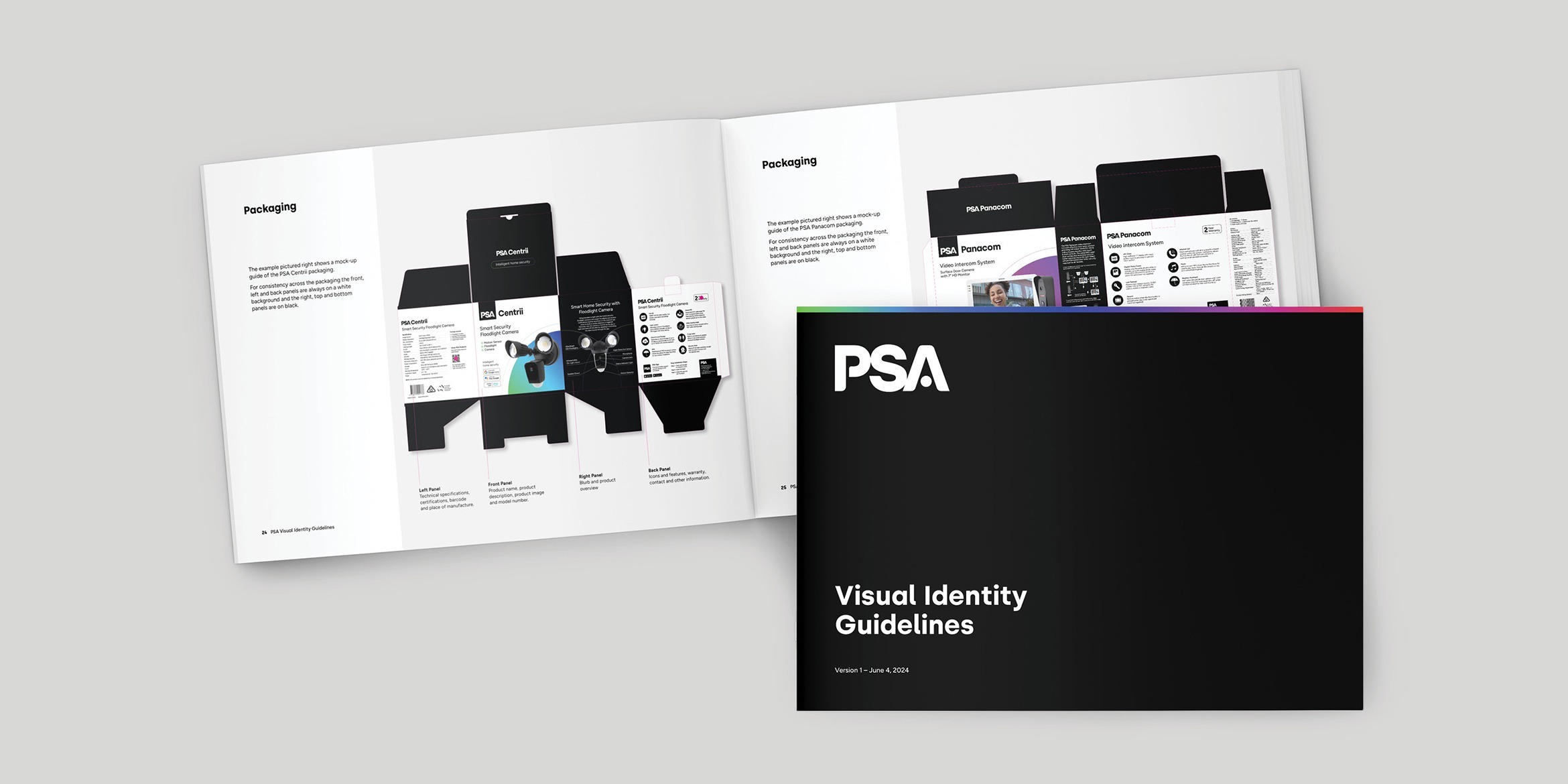
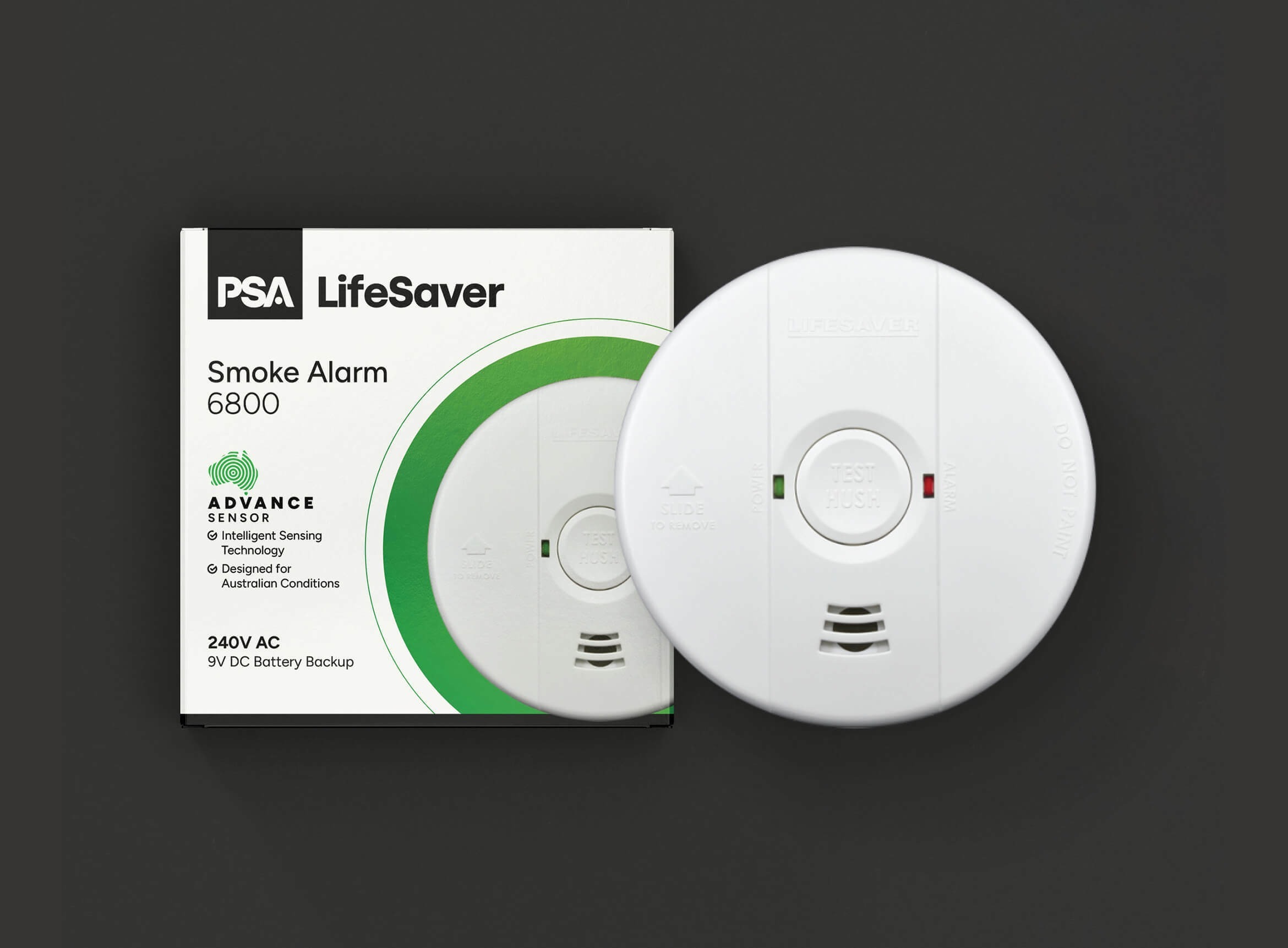
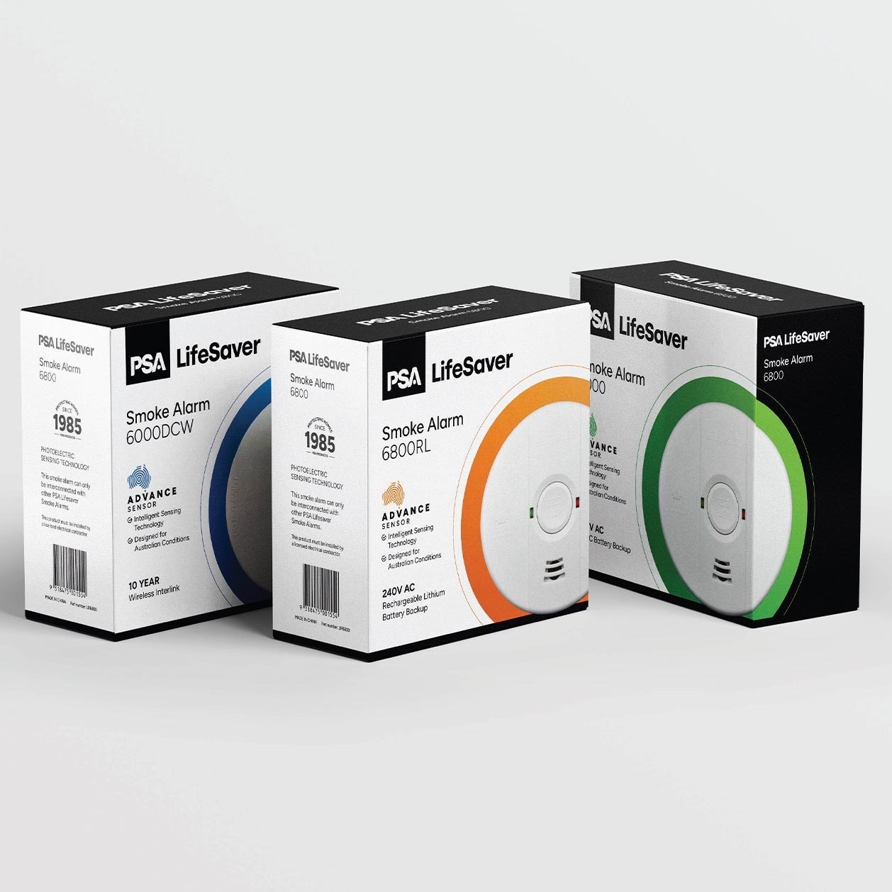
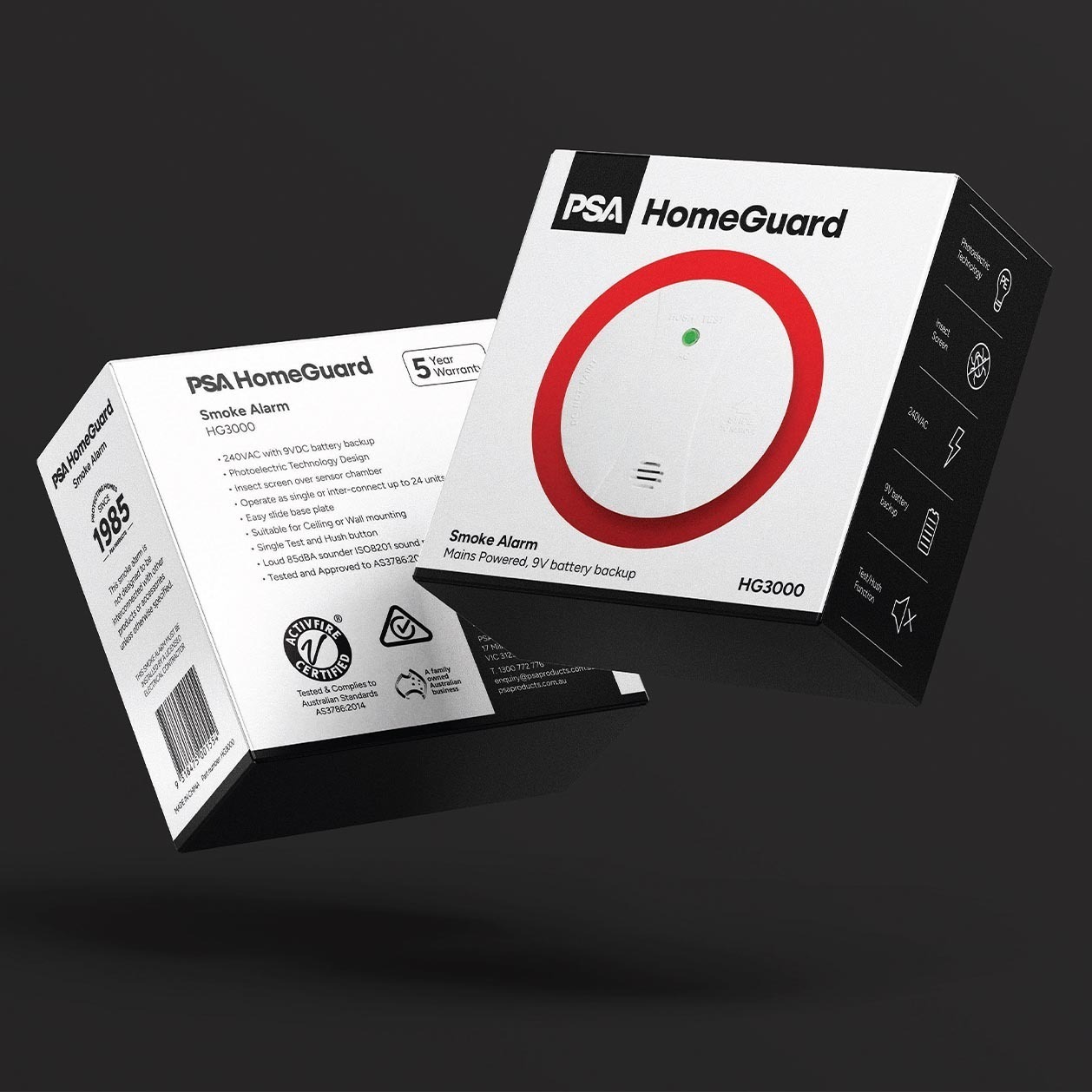
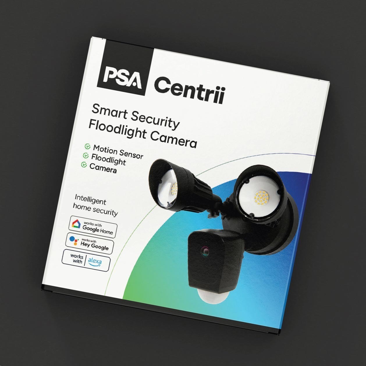
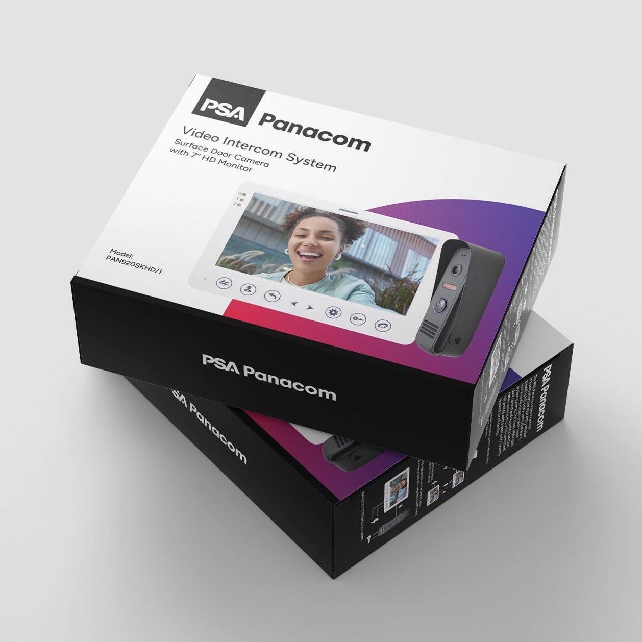
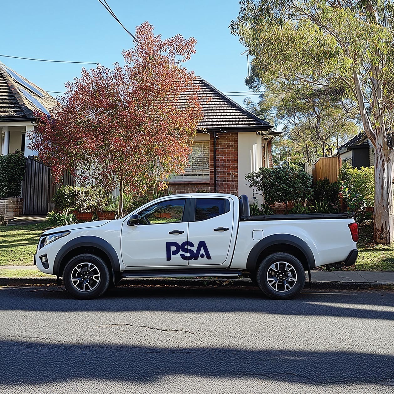
Given the importance of brand recognition and market appeal, we designed a contemporary, cohesive packaging system anchored to the PSA master brand. Colour usage was adapted from legacy product lines, and the new visual treatment expanded on the signature circle found in the updated logo. Brand merchandise, apparel, and vehicle decals confidently embrace the black-and-white primary colour palette, creating a strong, professional look. This ensures PSA’s employees and partners are proud to wear and display the brand.
Outcome
PSA’s rebrand marks a bold new chapter in their 40-year legacy. By shifting to a unified brand architecture, adopting a bold new visual identity, and introducing a tagline that speaks to their core values of safety and reliability, PSA is now perfectly positioned for future growth. The rebrand has not only elevated PSA’s image but has also strengthened their connection with both customers and employees, ensuring the brand remains strong for decades to come.
