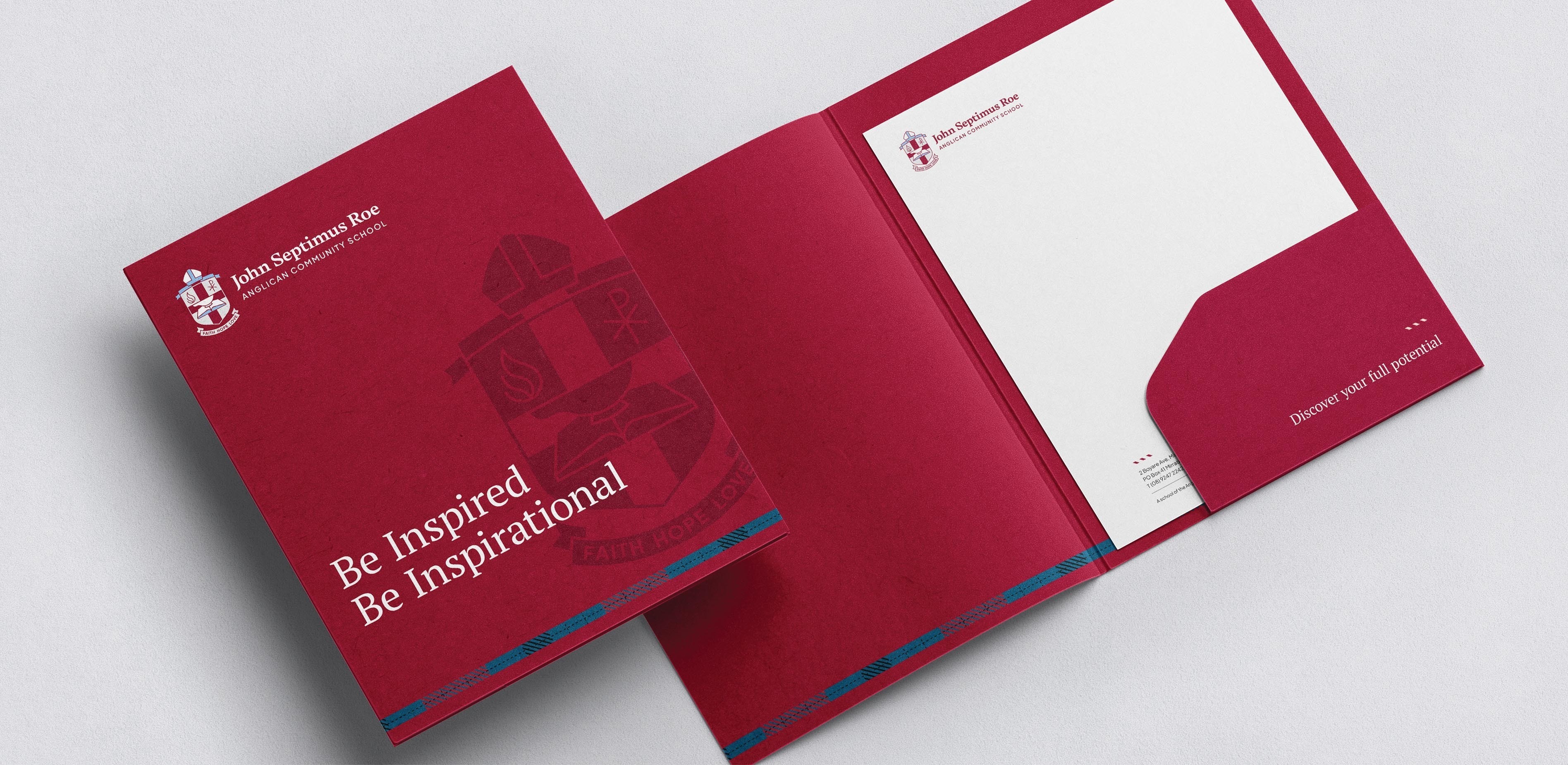
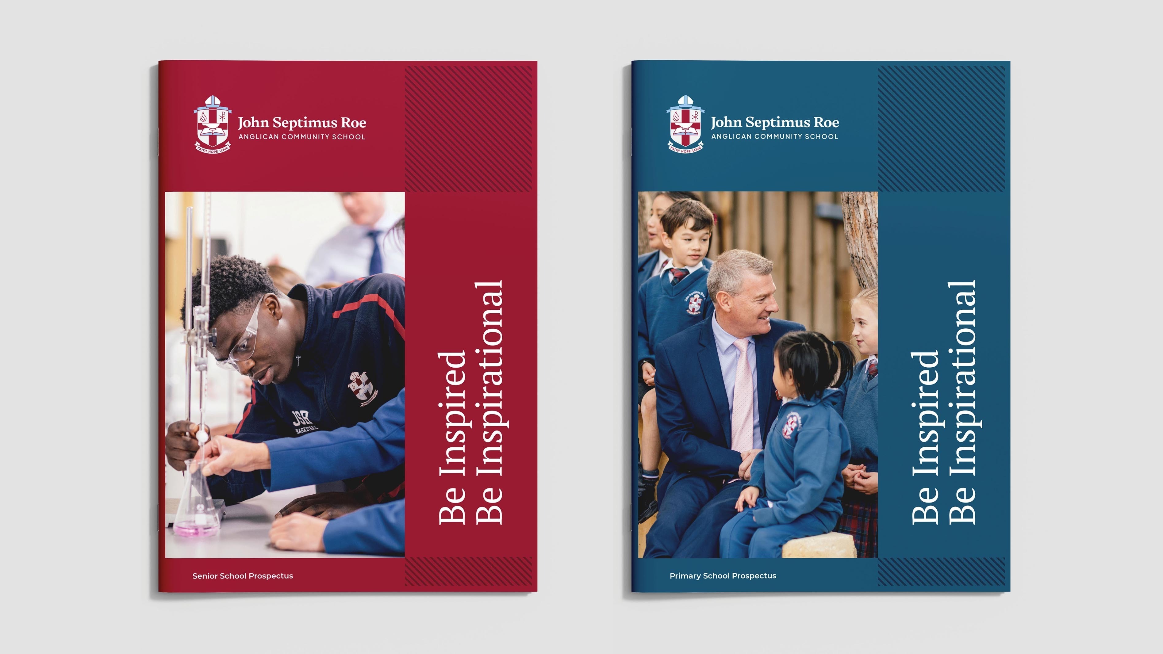
A logo that works harder
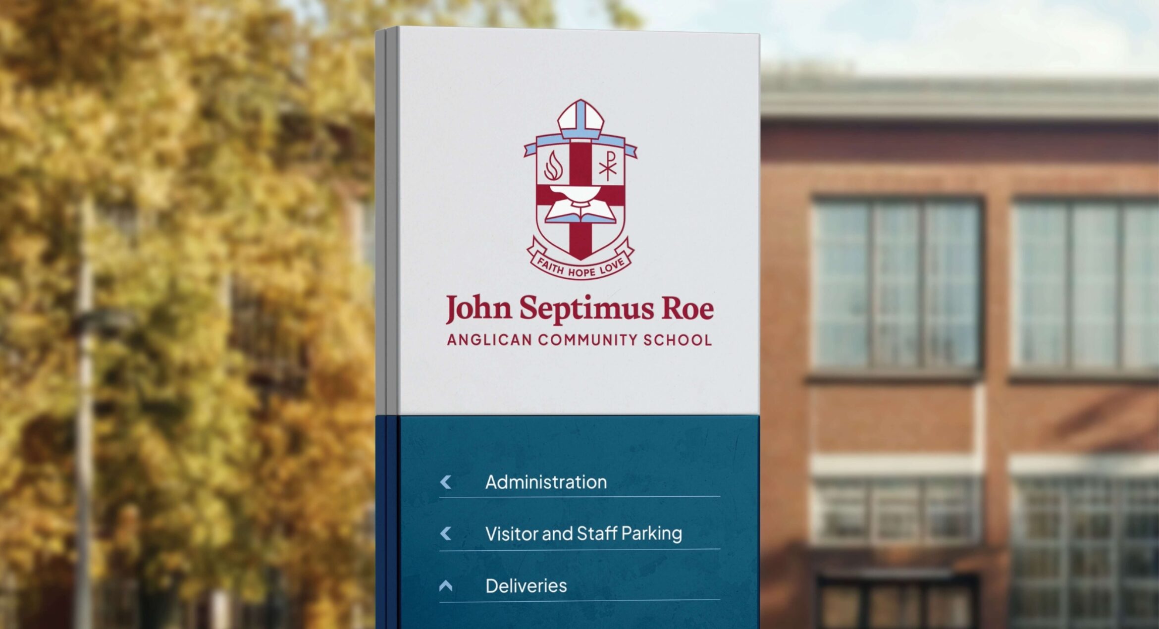
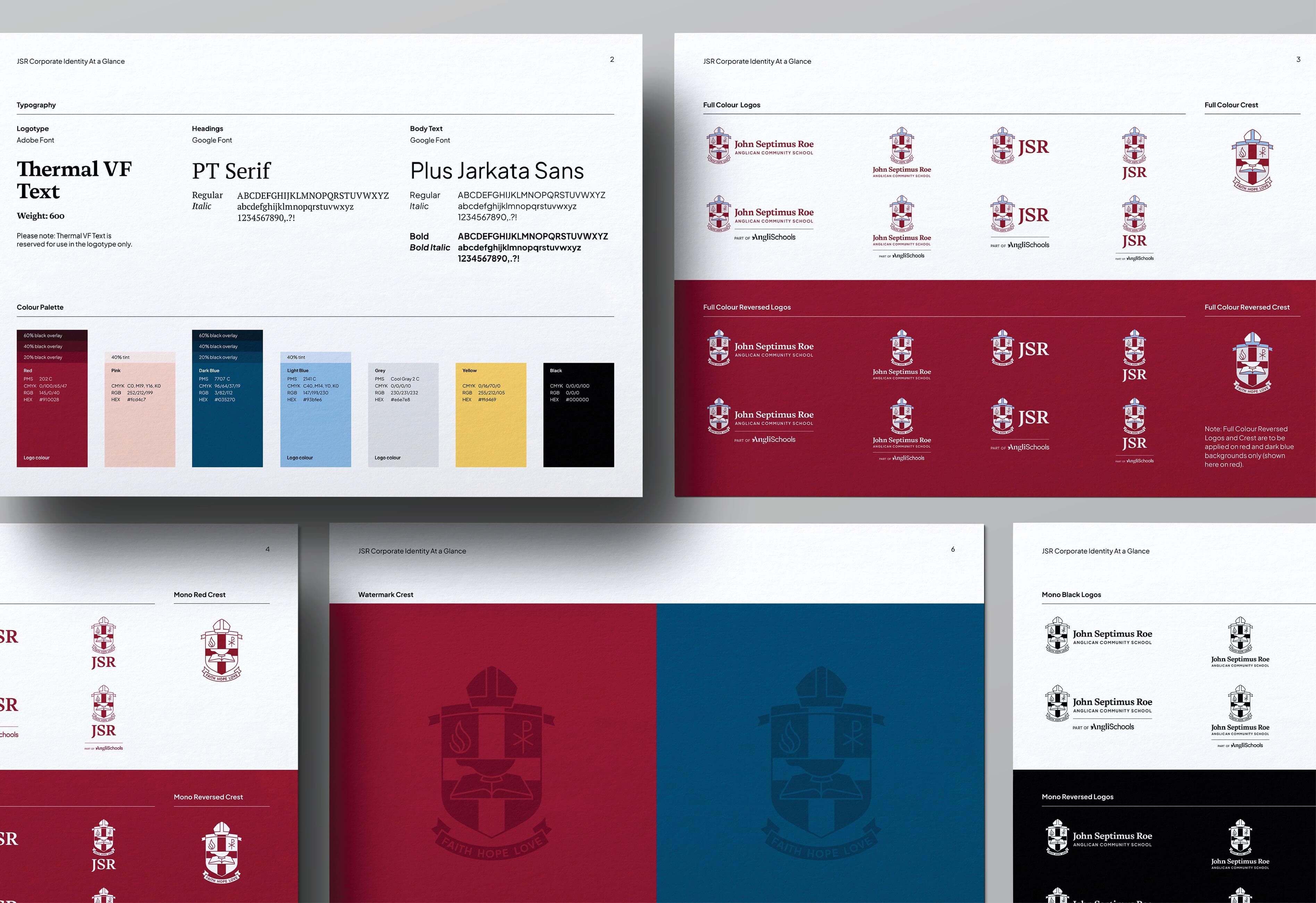
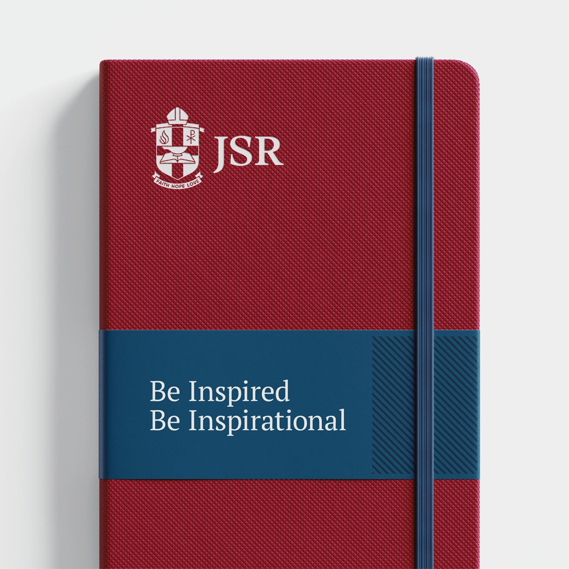
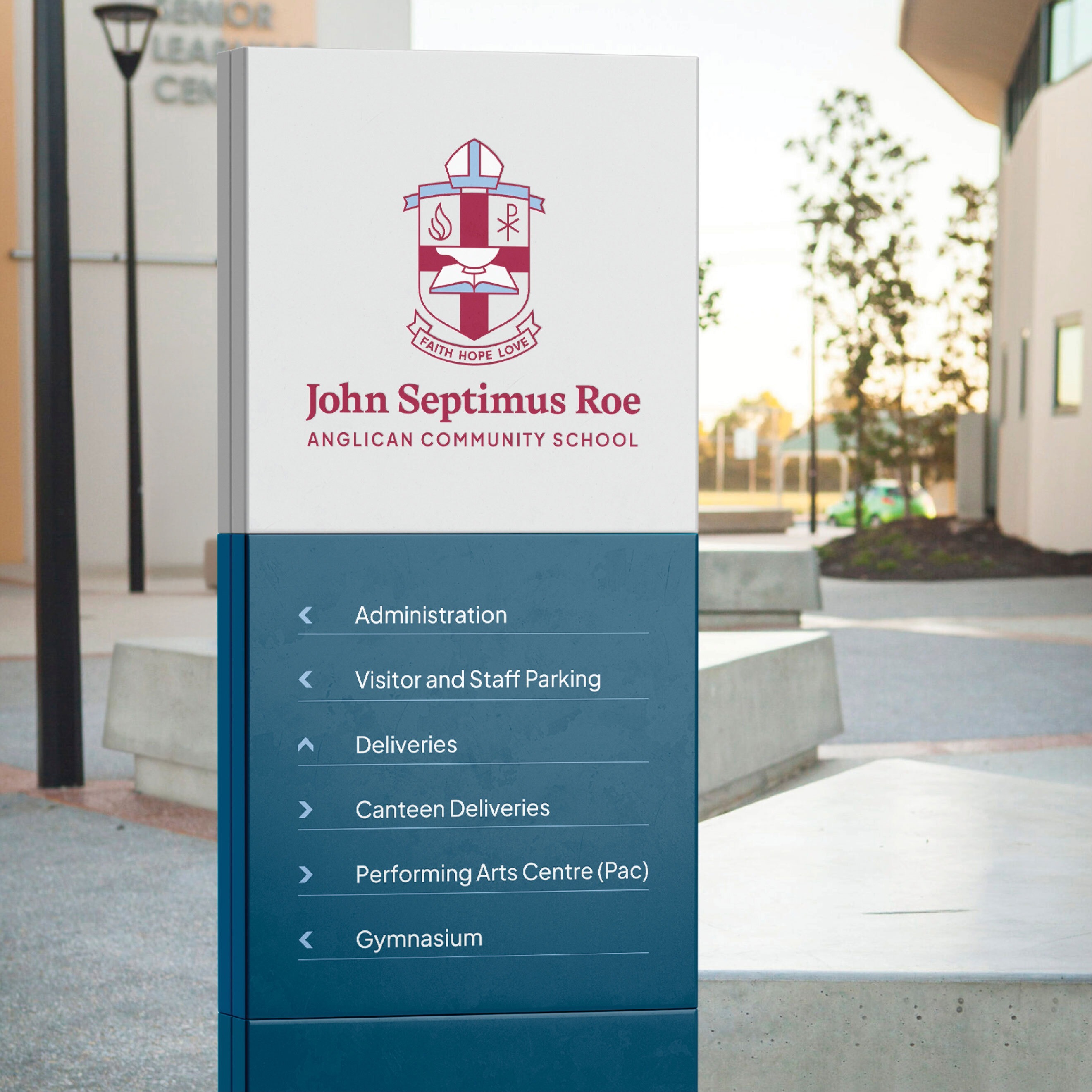
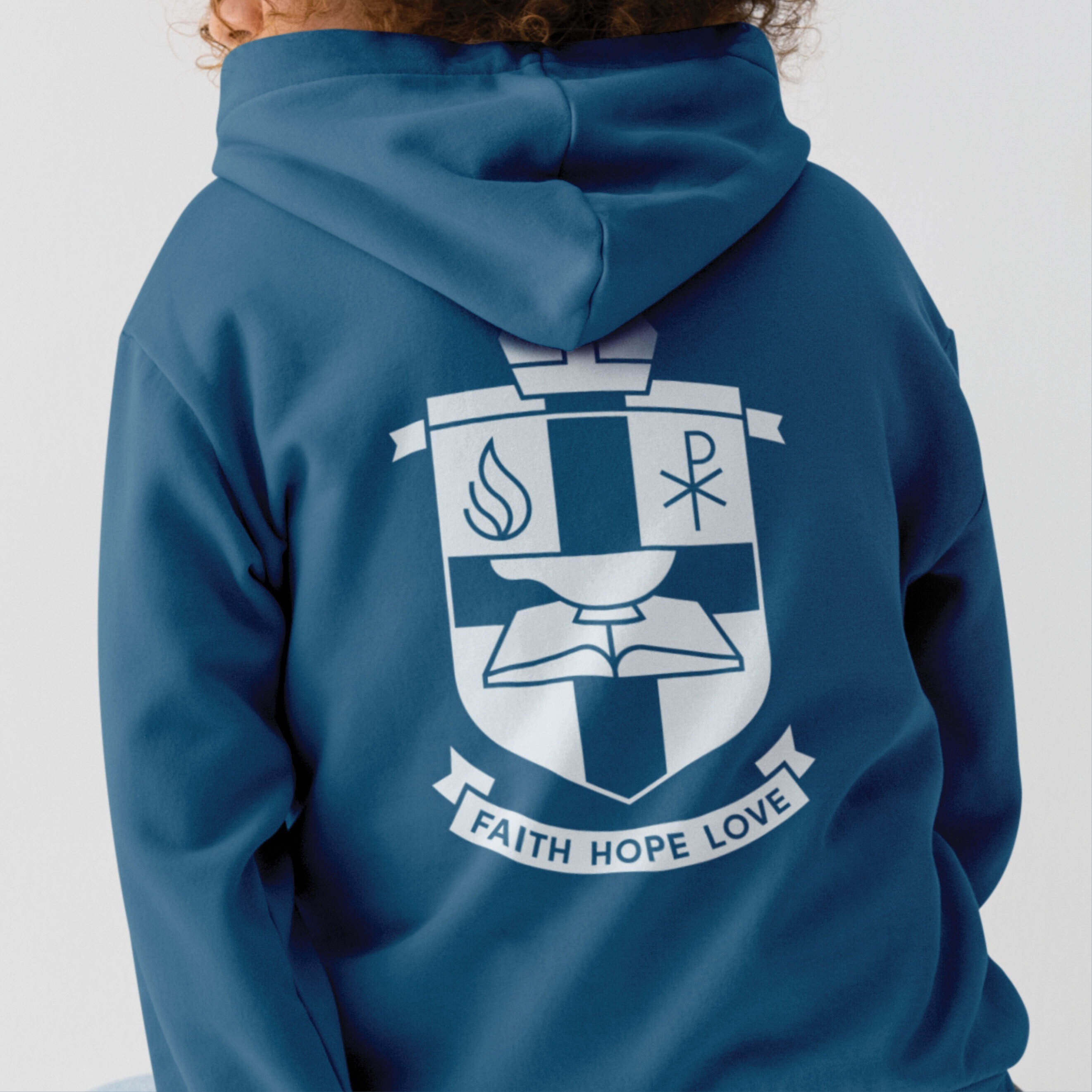
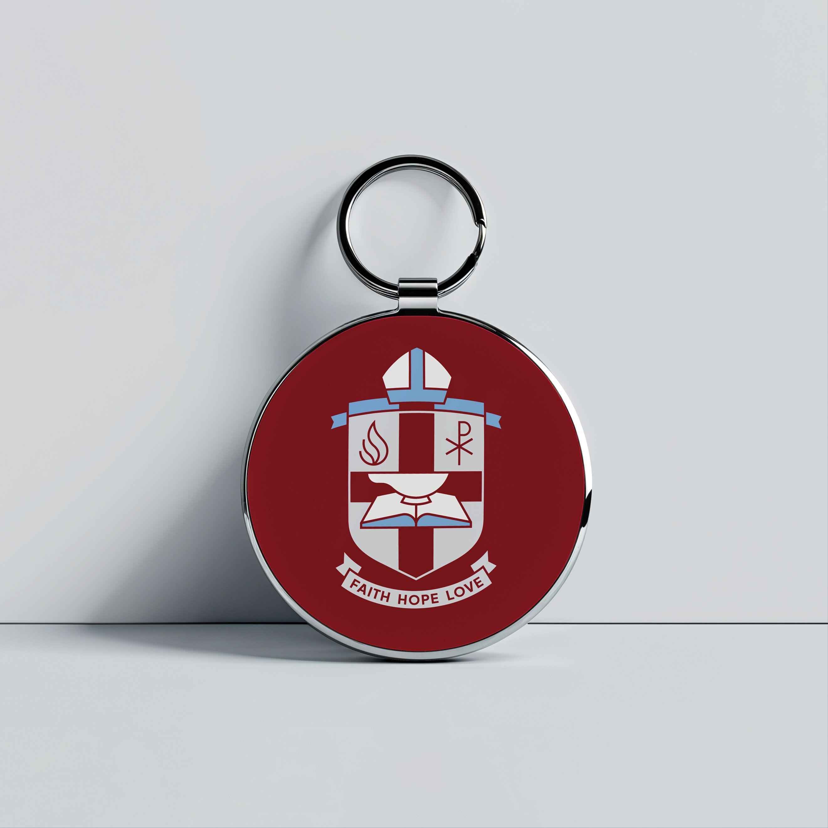
JSR’s crest is a meaningful emblem for the school community, but its application had become inconsistent and difficult to work with. Our redesign improved legibility and structure, allowing the crest to scale more effectively across print and digital formats. We introduced a flexible logo system with formal and informal versions, including ‘JSR’ shorthand, horizontal and stacked lockups, and options for co-branding with AngliSchools. The result is a logo that retains its meaning while gaining the versatility a modern school brand demands.
Visual simplicity with a story to tell
We distilled the school’s previous graphic language, a distinct but overwhelming tartan pattern, into a subtle hatching device inspired by the lines found in school uniforms. This graphic element became a central thread in the refreshed visual language. It is adaptable, ownable, and brings a quiet confidence to everything from brochures and presentations to digital collateral.
Type that strikes the right tone
Typography played a pivotal role in conveying both tradition and modernity. We selected typefaces that feel trustworthy yet contemporary, ensuring they are easy to use across internal platforms like Microsoft and Google, while still delivering visual impact in designed materials. The result is a more unified and professional look that aligns with JSR’s values and ambitions.
A colour review, not an overhaul
JSR’s core colours of red, blue and grey stood out within their competitive landscape. Rather than reinventing the palette, we focused on refinement. We addressed accessibility concerns by boosting contrast and clarity, and introduced a complementary secondary palette to provide greater flexibility when needed.
A simpler and stronger identity
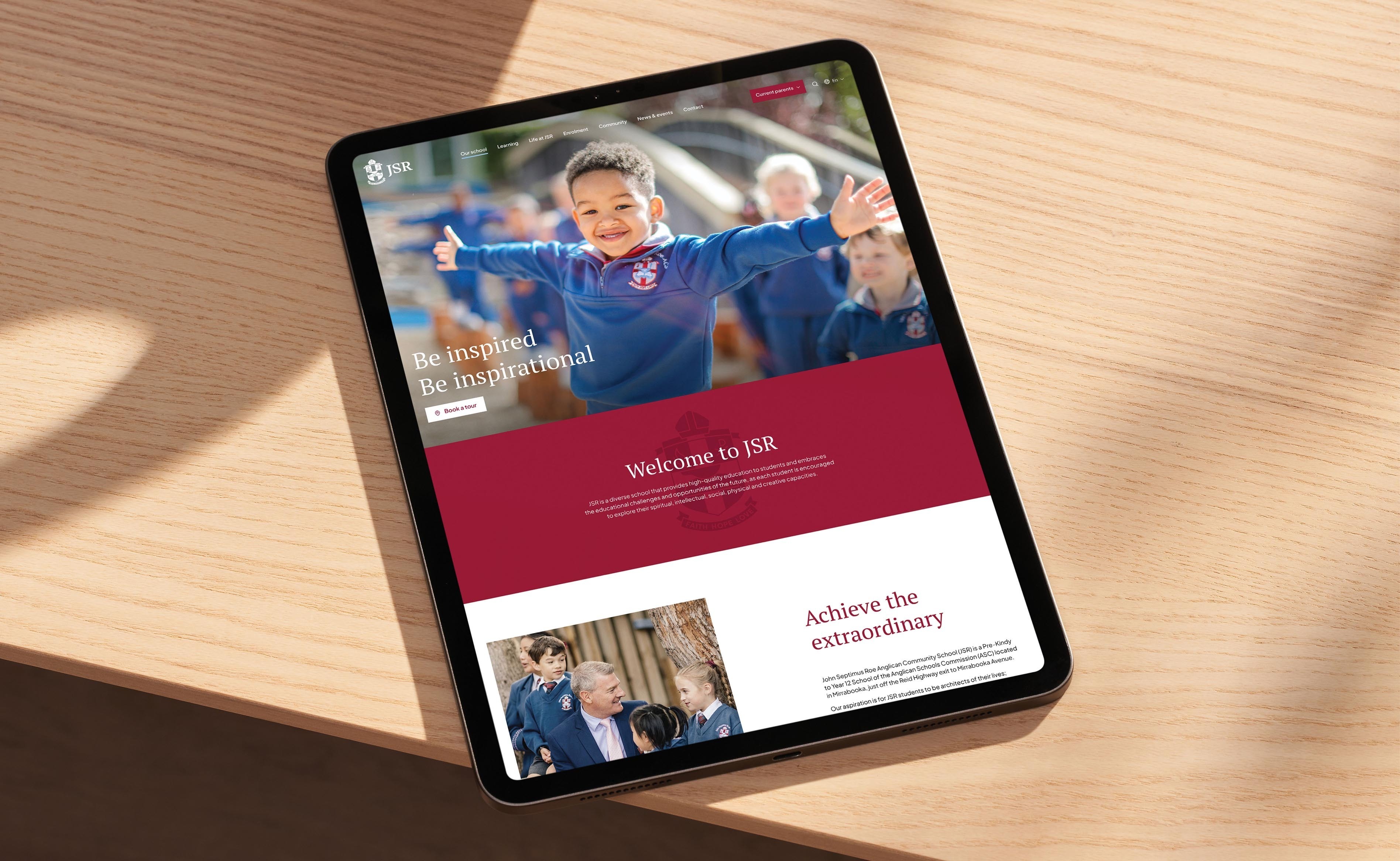
What began as a need to address brand inconsistencies became an opportunity to simplify and strengthen the entire identity. We focused on building a clear and cohesive system, uniting logo, typography, colour and graphic elements in a way that was purposeful and practical. The brand revitalisation work now enables the school’s brand DNA to be applied consistently across a suite of foundational assets, including a new custom website. The result is a modernised brand expression that works seamlessly across all applications and gives the JSR community a renewed sense of pride and clarity.