A Refined and Cohesive Visual Direction
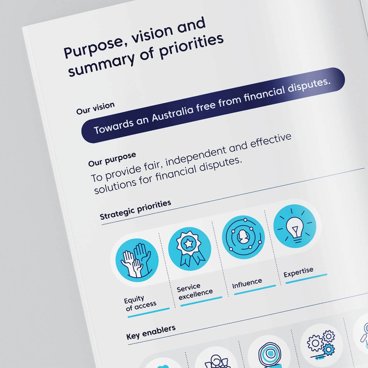
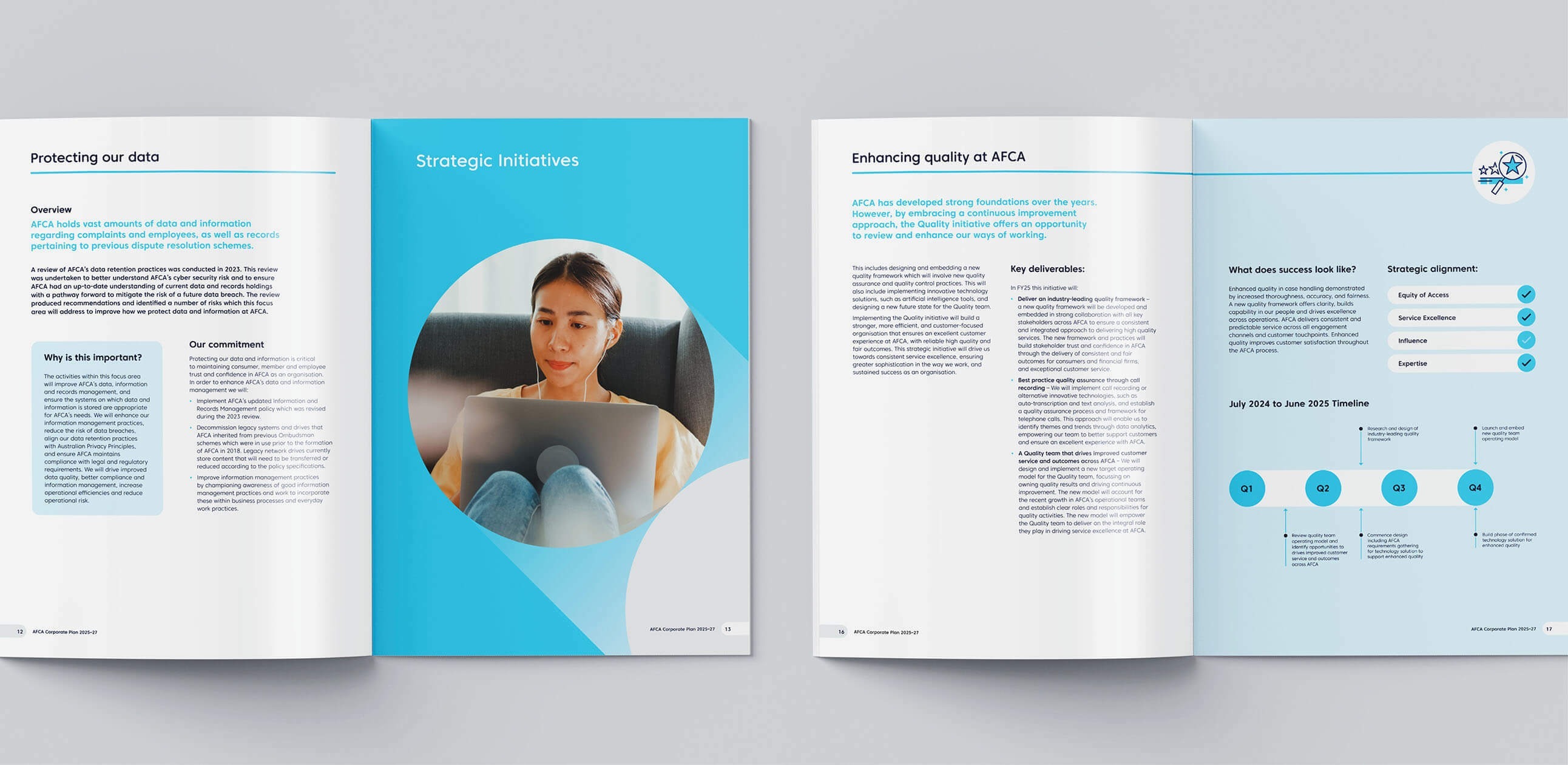
AFCA sought a new approach to their strategic documents, one that embraced evolution while maintaining brand continuity. With a strong emphasis on white space and clarity, we designed a set of publications that distilled complex information into a visually engaging, easy-to-navigate format. The structured layouts, thoughtful typography, and strategic use of colour reinforced the organisation’s key pillars while enhancing readability.
Bringing Strategy to Life Through Visual Storytelling
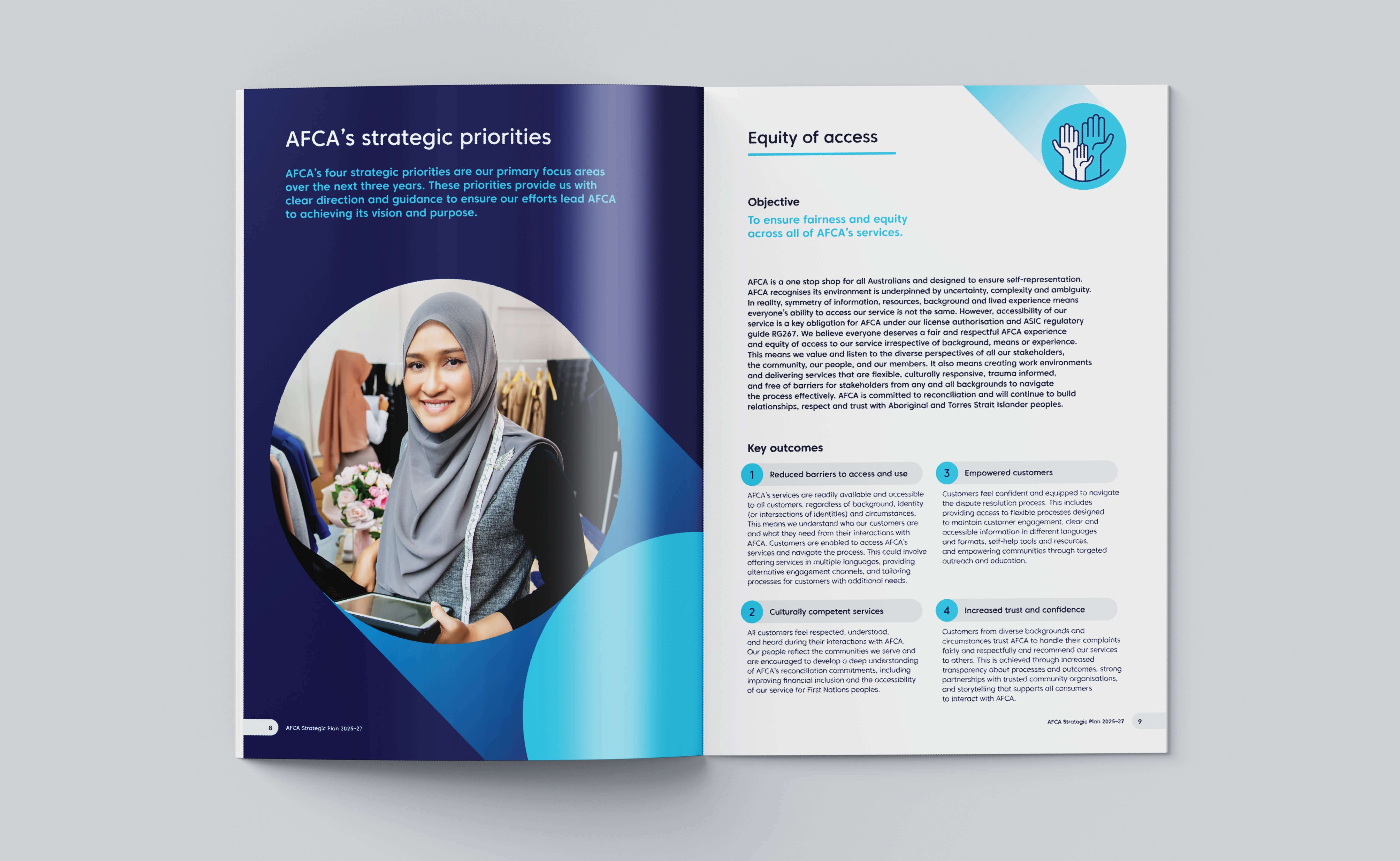
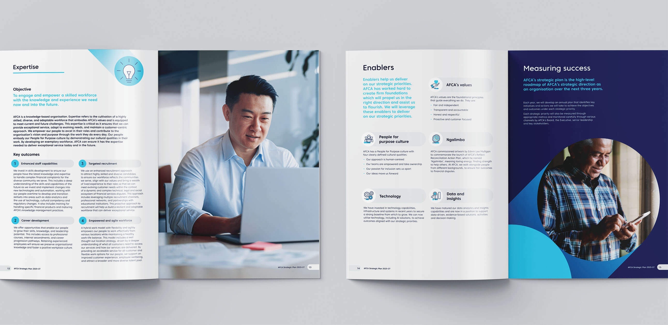
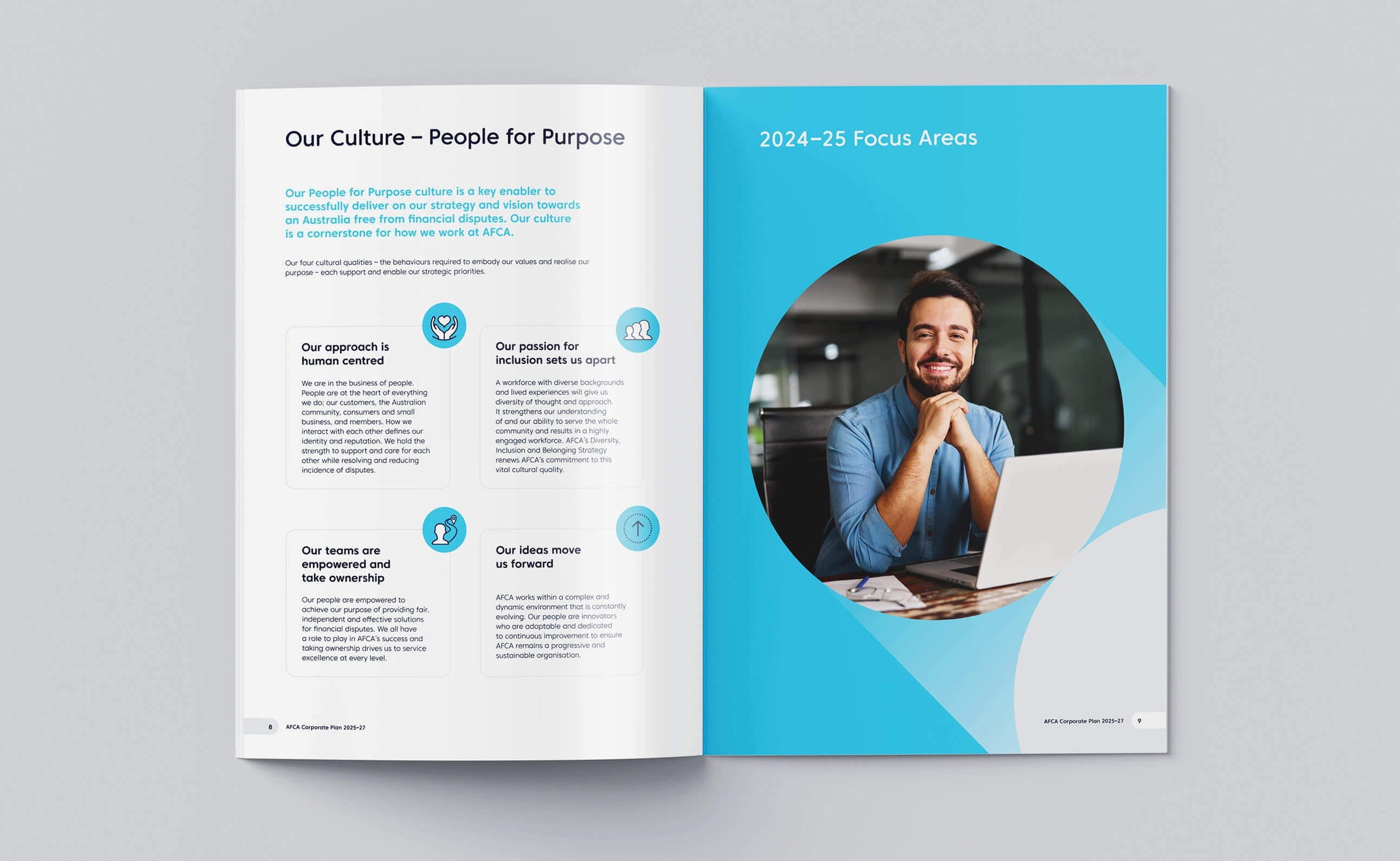
Photography curation played a pivotal role in reinforcing AFCA’s core values. We selected imagery that authentically represented Australia’s diverse population—spanning different ages, cultural backgrounds, and business environments. Whether showcasing everyday Australians at home, small business owners at work, or AFCA’s dedicated employees, each image was carefully chosen to reflect the people they serve.
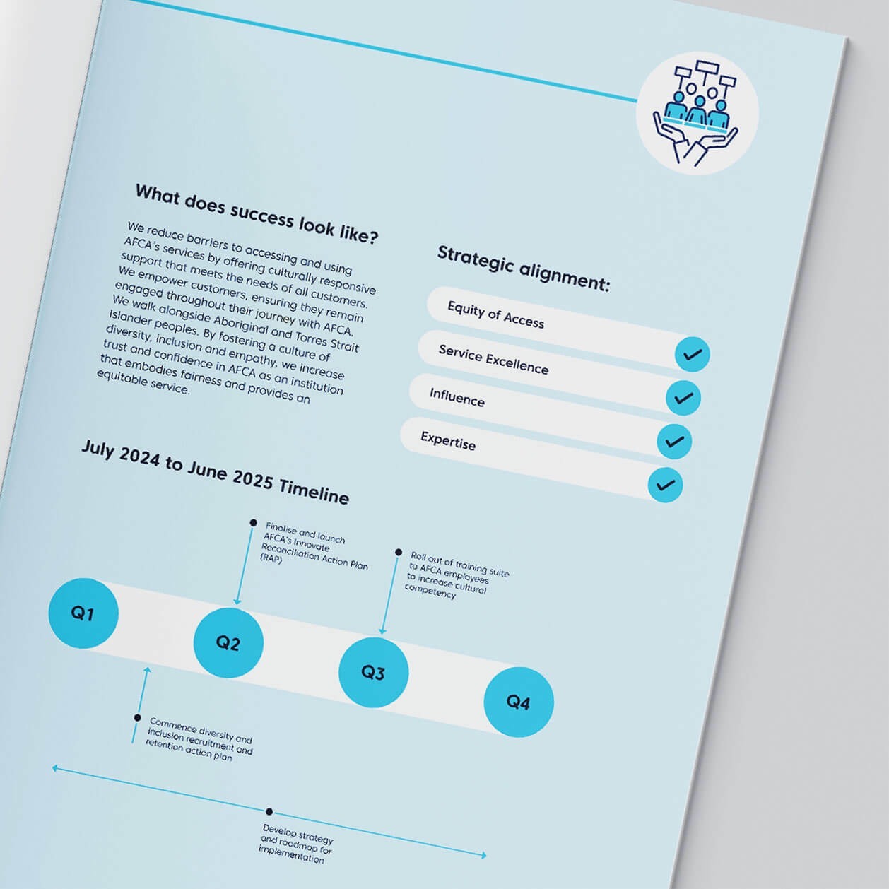
To further enrich engagement, we refined a suite of icons tailored to AFCA’s strategic priorities. These icons acted as visual cues, making dense content more digestible.
Collaboration That Sets a Benchmark
Working closely with AFCA’s communications team and key stakeholders, we established a refined visual direction to guide their corporate publications. More than just a design uplift, this project set a new benchmark for AFCA’s key documents—ensuring their strategic messages are not only seen but truly understood.
By combining strategic thinking with considered design, we helped AFCA evolve their communications in a way that’s both impactful and enduring.