Annual Report design inspiration
Annual Reports are evolving to become comprehensive marketing tools that celebrate the culture and successes of an organisation, are used for marketing and promotion, and are a major tool for attracting funding and donations.
Infographics are a great way to display statistics and facts about your services in a way that tells a story.
Use bold colour palettes to make your Annual Report come alive. This will encourage reading of important aspects of the report and break detailed information down into more digestible chunks.
Include the people and personalities of your organisation in your annual report. This will help it to be received better by stakeholders and used as a marketing document or donor retention and attraction tool.
We specialise in crafting Annual Reports that create meaningful and powerful connections with readers.
Annual Reports are evolving to become a comprehensive marketing tool that celebrates the culture and successes of an organisation. They are much more than a set of financial figures with some statutory reports, so it is increasingly important that the design and structure of your company's Annual Report reflects the personality and vision of your brand.
Smart marketers are using elements of their Annual Report for marketing and promotion - integrating design elements that allow parts of the report to be repurposed for promotional activities. In many instances, such as health services and not-for-profits - the Annual Report is a major tool for promoting your services and attracting funding and donations.
Good planning and Annual Report design and content consultation will result in a document all stakeholders will take pride in, as well as a set of valuable stand alone resources that can be used to market your success over the coming year.
Click here to view our annual report design packages.
Injecting your unique company culture into your Annual Report design results in a document that truly reflects your accomplishments and is a joy to read.
For community-focused groups, such as Government funded organisations, health providers and not-for-profits, your Annual Report is the most important document you produce to describe the services and results for each year.
Interested in a digital annual report?
Learn More
3 trends for Annual Report design
Here are the top 3 design trends Thirst Creative is using in our client's Annual Report designs:
1. Reporting infographics
Infographics are essentially the old-fashioned flow charts concept on steroids. They are a visual way of displaying statistics and facts about your services in a way that tells a story.
They make a great, easily digested feature within your official Annual Report document, but they really shine as stand-alone poster-style summaries for display in your offices or waiting rooms.
For universities and educators who need to communicate achievements to many stakeholders, an infographic is a great way of sharing the success of the university.
For example, Melbourne University’s Annual Report (pictured) features a series of Infographics that summarise its core service successes in a visual and easily understood format.
Read our Melbourne University case study here.

2. Bold brand colours
Say no to more tombs of white paper with black text and no colour. If you want your Annual Report to inspire your stakeholders make it something magnificent that reflects your brand and the energy of your organisation.
By integrating bold colour palettes that reflect and highlight the brand's visual style to make the whole Annual Report document come alive. Bringing colour and contrast into the report page design, we’re able to encourage reading of important aspects of the report, and visually break detailed information down into more digestible chunks of content.
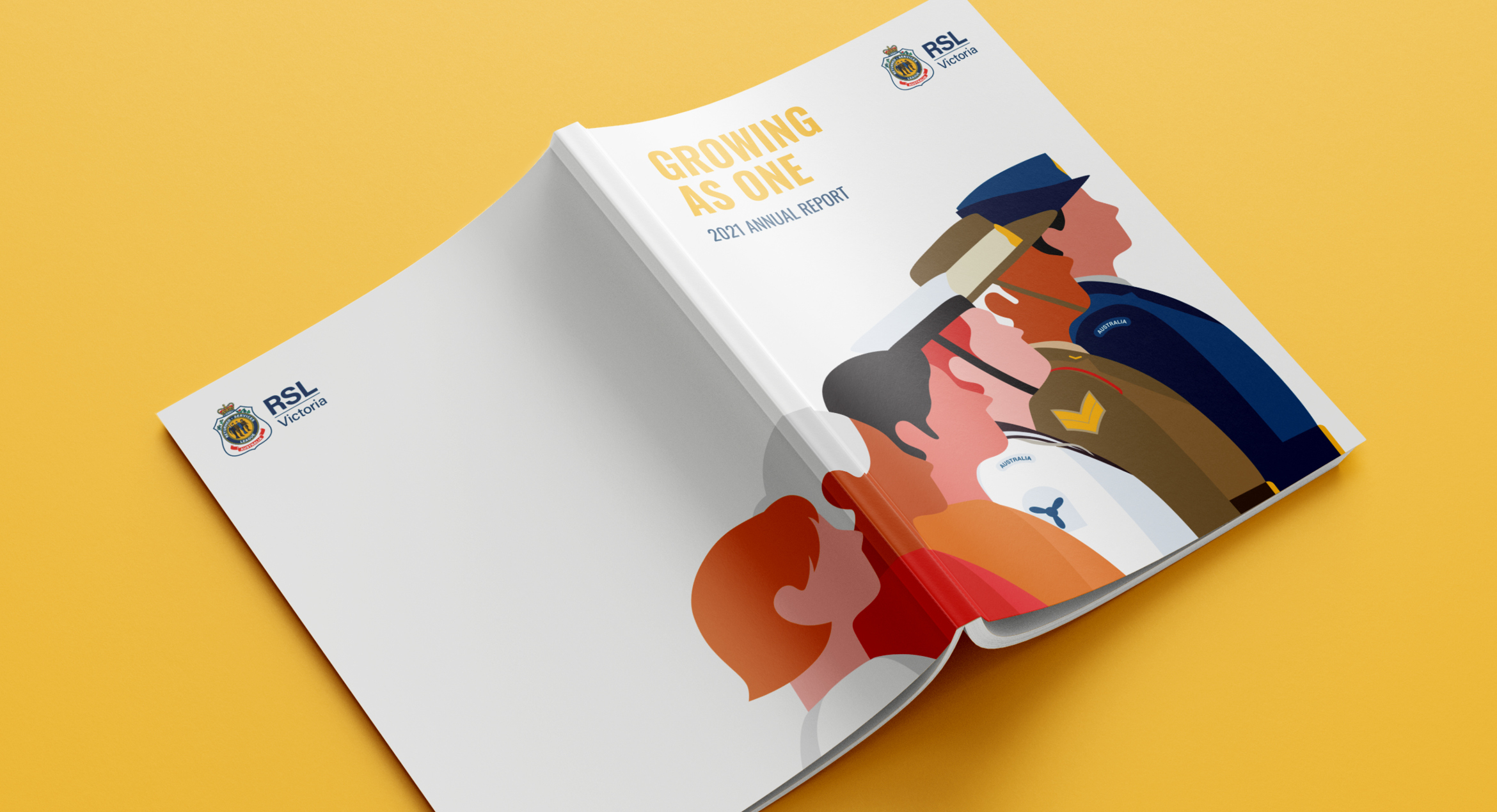
For example, the RSL Victoria Annual Report (pictured) features bold, bright colours and dynamic imagery to brighten the reader experience and boost engagement.
Read our RSL VIC case study here.
3. Show your people
It’s a social media rule of thumb to show people and it works just as well in Annual Report design. People respond to other people.
Bring the people and personalities of your organisation into your annual report. Too often we get lost in the financial details and we forget to include the stories of the people who work within the organisation, and those that benefit from your services.
Work with your designer and content developer to discuss how to showcase your people through case studies and achievements, and what these reflect about your organisation. For example, a staff member retiring after 40 years may not seem relevant to stakeholders, but it showcases loyalty, a strong team, and organisational gratitude.
If you are a service industry then showing the faces of your organisation could make a huge difference in how your Annual Report is received and its success as a marketing document, or retention and attraction tool for donors.
Service Stream is a S&P/ASX-listed company that specialises in the design, construction, operation, and maintenance of critical assets. With multiple communities relying heavily on their services, it was vital we brought their Sustainability Report and Annual Report to life with clear direction and visual clarity.
How did we achieve this? Through placing a heavy emphasis on what sets Service Stream apart; it's people.
Read our Service Stream case study here.

Looking to achieve more with your Annual Report design?
With many years of expert Annual Report design experience, we specialise in crafting reports that create meaningful and powerful connections with readers. Whether it’s small or large, printed or interactive – our team can turn your Annual Report into an asset that works as hard for your business as you do.

